Scope of operation
Jetcamer is a startup operating between USA and Africa planning to expand its service in Canada and Europe.
My Role
As the main UX Designer, I took part in all phases of the project. I started it from scratch and finished by delivering UI design.
Tools
Sketch - Adobe - InVision - Paper & Pencil
Process
Need Statement
To identify pain points and re-design a clean, simple user interface for improving the user experience of Jetcamer.
Observe
I start with the problem of assumptions about Jetcamer wallet. These assumptions are based on my testing:
User interface needs to be updated and redesign the all home page
Add more features to enable users track their past transaction history, pay utility bills, purchase (airtime, TV cable & mobile data), create group payment feature and be able to top up online accounts.
After brief observation, I felt that user experience had so much room for improvement
Understanding the problem
To understand the root of problem, I conducted user interview with Jetcamer’ Co- founder and other users the questions that focus users engagement with jetcamer mobile app, their experience and what they expect out of the payment service.
The findings are:
Most users are confused to identify and understand the role of certain features
Users are unable to access their last month transactions history
Users are limited to fully use the app for the lack of other payment features such as utility bills payment, shopping and group funding contribution.
Unused space
Usability Testing
To understand more about the problems, I conducted usability testing to validate more about the problems
Persona
Based on the research found during my interview, I decided to focus on designing African migrant tech worker as one of the participants interviewed.
Persona help me better understand the target audience and create the product that will adapt or refer to users needs.
Define
Understanding user’s problems in above exercise and defining the problem statement
Task Flow
Based on the user feedback, I’ve created a user flow diagram to map every step of the user interaction required to achieve the main goal and complete the task faster.
Task selected to be completed by user:
As a user, I want to pay electricity bills through Jetcamer
As a user, I want to create GroupFund by inviting my contacts to contribute financially to a friend wedding
Ideate & Design
Wireframe
Understanding the user’s concern to be solved, I sketched out on pen and paper low-fi versions of mockups, with each screen aiming to solve problems and update the app for users needs. By sketching on paper, it helps me quickly iterate through many design ideas.
Hi-Fi Mockups & Prototypes
Once I had the sketches, it was time to implement my solutions, I imported them into sketch and began mocking up the hi-fi screens and creating the prototypes for each of them
Key changes:
QR Scan - Users can scan QR code of the merchant for instant payment
Notification - Will keep users informed about sent or received payments and notifies user of any wallet activity or bill dues date
Home page new features - revamped homepage by adding more features that will bring value to the platform. These features are (group fund, pay utilities and stores)
Send money page - improve sending page flow by adding more options (View limits of money to send, information icon and messaging option)
Key changes:
Pay bills - listing of services provider
Payment methods page - giving users opportunities to use personal credits cards and possibility to add new bank account
Visual response made after payment confirmation made in clear appealing form with all facility to download a receipt
Key changes:
Request page - Simple and easy page flow with message to the recipient option
Visual response made after the money being requested made in clear appealing form
Recharge/ top up page - Designed with different mobile network integration option
Key changes:
Organized past transactions chronically - Users can view summary information that includes the date, amount, position, and status of each transaction made through the app
Menu & Settings - Well organized content can help users to save his/her time, manage settings and contact support fast and smooth
Clickable Prototype
Testing
I used InVision to create a clickable prototype and tested it with three individuals. Insight from the validation test led me to revise some of the screens. Below are the final versions, including some results of the user testing before and after implementing design solutions.
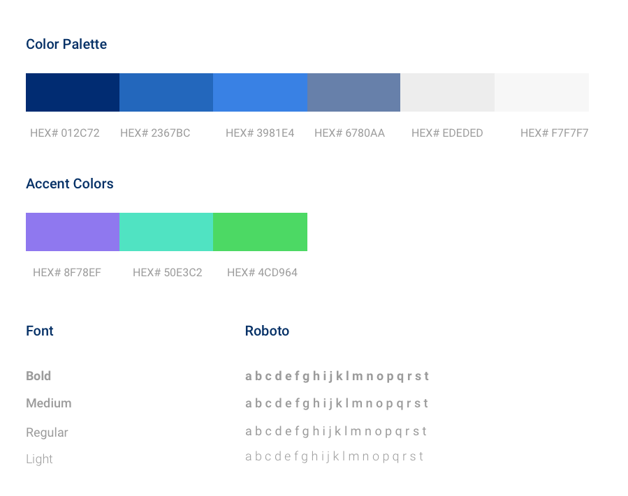
Style Guide
Lesson
Research is a must - The User interview revealed information and helped to adapt the product to users’ needs
Persona is powerful - Being aware of users’ needs and pain points helped me to create end-to-end experience


